The making of #ShutDownSTEM infographics of scientific articles
By Luoth “Lu” Chou
I am a visual learner. One of my favorite things to do, albeit strange, is to create graphics for science. Sometimes it is stressful, daunting, iterative, boring, and just all too time-consuming. Yet I do it any way-- to better explain a problem, convey numerical information, simplify complex topics, produce digestible plots, and of course for my own research: be it to generate a manuscript figure or make a presentation.
On June 10, 2020 during #ShutDownSTEM #Strick4BlackLives movement, I knew that enough is enough-- and that now, more than ever, is the time to call out science for the racist institution that it is. And for me, a field that is closer to home: geosciences. Giving power to black voices is a fundamental start, but I wanted to do more. I wanted to learn, and I wanted to take that learning and apply it, using science that is backed up by (you guessed it) the scientific method.
It was inevitable then, that for #ShutDownSTEM #Strike4BlackLives, I gravitated towards my passion for learning through making graphics. One of the biggest challenges that I found about addressing deeply rooted systemic racism in STEM is understanding: what is the existing consensus on racial disparities in academia? What do the experts say about the groups of individuals who are vastly underrepresented, undervalued, and undermined in STEM? What has been proposed as solutions to fix the “leaky pipeline” that, for the most part, affects people of color at all intersectional scales?
I decided to spend June 10 (and beyond) making infographics about what I learned by reading peer-reviewed articles. These articles are based in the literature in Education, Applied Psychology, and Sociology that contains crosscutting themes with Race & Ethnicity as well as Gender Studies, or commentary articles in general about the state of the culture. These papers provided me with in-dept insight into the existing state of knowledge on race and racism in STEM and academia.
Here, I share some of the tips on how to make a useful infographic. It is still a learning process for me, so by no means is this the best or a standard practice. My hope is that it provides a useful tool to share your science and share your reading on race and racism in STEM. If you find it useful, I would also extend these methods beyond the papers you read here as part of GeoReadingForEquity and use these tools in your own research and studies.
The first step of course is to read and annotate the paper. I find it easiest to condense each the paper down into one sentence for each of the following criteria (1) problems + motivations (2) methods (3) general results (4) implications. This list can be expanded, of course, but it provides a good start for extracting useful information out of a dense peer-reviewed paper. Some call this an annotated bibliography. The next step, then would be to put it all together into a graphic. (See Graphics Here)
Here’s a list of rules and objects that I find useful:
1. The less text, the better:

I abide by this rule not only for inforgraphics, but for my presentation slides in general. It’s generally important to account for people with lower attention span, especially if you expect to share a graphic on the internet (e.g., Twitter). You want it to be attention-grabbing beyond the aesthetics as a person is scrolling on their device, and just like in a conference presentation, large blocks of texts can be attention-deterring.
2. Have a “main problem” and a “take home messages” field:

I like to think of these as an abstract to the abstract in the paper. It is best to describe the main problem and main overall discovery of the paper in Tweet-sized statements. These are to convey information for those who are truly short on time.
3. Include simple, thought-provoking, or eye-grabbing plot(s)
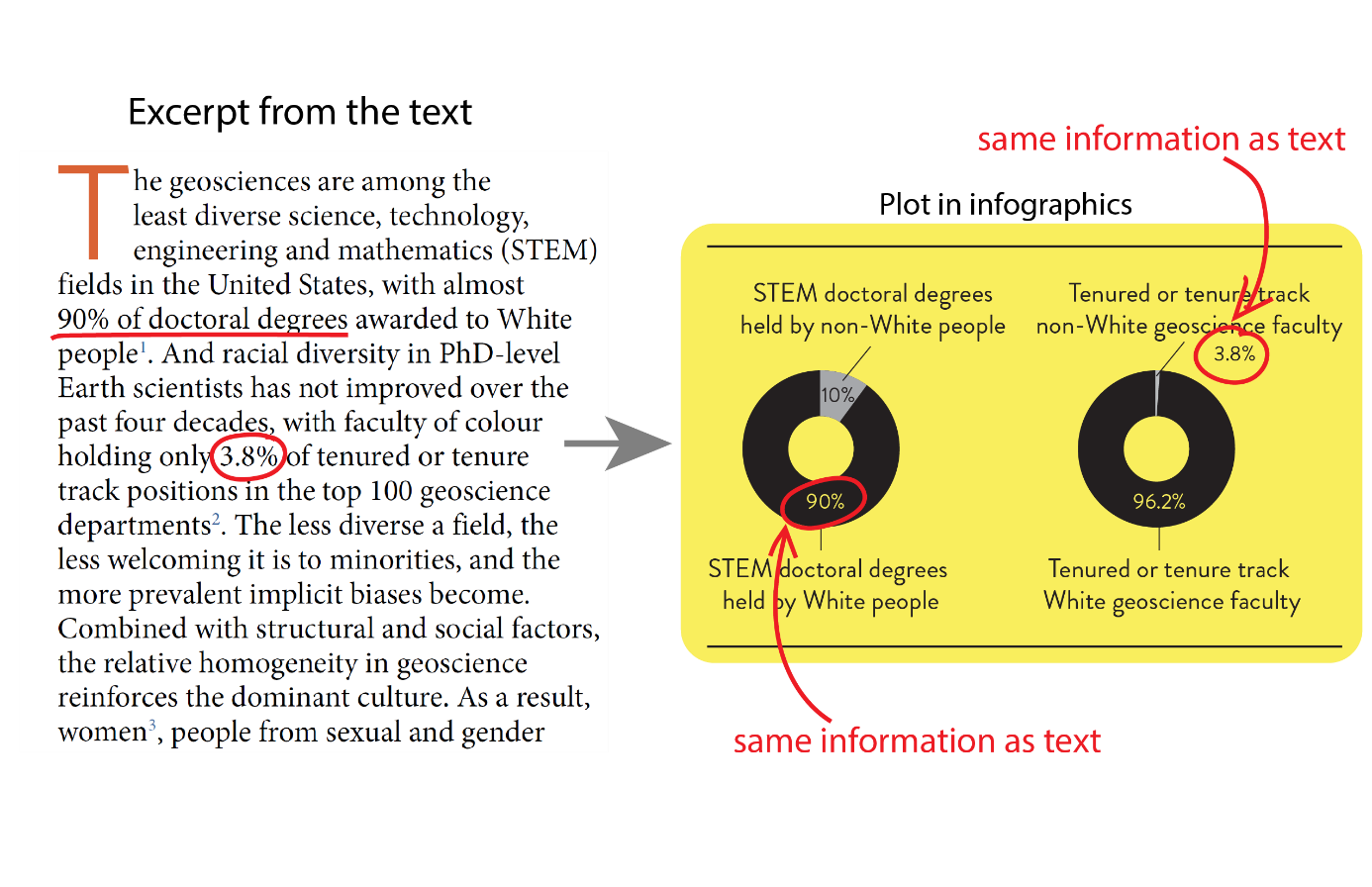
If the plot of the paper is nice, simple, and informative, I would directly use it to express relevant information. But often papers cite important numbers in the text and do not show a visual. If those numbers convey information better than typing out a statistic in text, I would plop them onto a spreadsheet or python and quickly produce a plot (e.g., histogram, time series, pie charts, etc). I then transfer the plot over to my editing software and dress it up there.
4. Pepper in details, but not too much:

A useful thing that I tried to do in this series of inforgraphics is to provide concrete guidelines that ally scientists can start to implement to battle racism in academia. You can think of these as recommendations drawn directly from the study (if the author provide them) or as a more detailed “take home messages”. These bits and pieces often highlight the importance of the study and why follow up studies are needed (which for the case of racism in STEM, more intervention protocols).
5. Credit the authors:
I am sure you all know what to do.
These steps helped me learn so much through my reading and also helped provide my colleagues with sharable and digestible information. I wanted the valuable time that we all will put into reading and learning about equity in geosciences to be meaningful, and I discovered that this was a powerful way to do it, not only in order to solidify these issues in my head (which I have later brought to Diversity & Inclusion discussions at my institution), but also share our knowledge with the general public. All of this is to truly enhance our fight against racism in STEM, and academia. I hope that this helps all of us better communicate our knowledge, and ultimately our science.
--
Footnote: the graphics editing software that I use is Adobe Illustrator. It is not necessary, however, to use Adobe to make these infographics—these steps can generally be applied to any other way of making figures (e.g., InkScape, Gimp, CorelDraw, or PowerPoint)
Check out the graphics so far (and add any you might make!)
About the author: Luoth Chou, Ph.D. is an astrobiologist and organic geochemist at NASA Goddard Space Flight Center and Georgetown University.